Color Contrast
Make sure your content has sufficient color contrast so it's easy to read.
What is color contrast?
Color contrast refers to the difference between the brightness of the background color and foreground color of digital content. It’s crucial in design, art and visual communication as it affects readability, visibility and aesthetic appeal.
High contrast (like black text on a white background) enhances clarity, while low contrast (like light gray text on a white background) can make content harder to read.
Why is color contrast important?
Color contrast is crucial for accessibility because it ensures that content is readable and distinguishable for all users, including those with visual impairments such as color blindness or low vision. Here are some key reasons why it's important:
- Readability: High contrast between text and background helps users read content more easily, reducing strain and improving comprehension.
- Visual impairments: Many people have difficulty distinguishing colors or may not see certain colors at all. Adequate contrast helps ensure that information is accessible to a wider audience.
- User experience: Good contrast enhances overall user experience by making interfaces more intuitive and easier to navigate.
- Focus and emphasis: Contrast can be used to highlight important information, guiding users’ attention effectively.
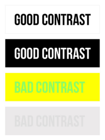
Four examples of varying contrast levels
with two good examples and two bad examples.
What level of color contrast is required?
The Web Content Accessibility Guidelines (WCAG) define minimum color contrast ratios for small and large text.
- For small text, a 4.5:1 contrast ratio is required.
- For large text, a 3:1 contrast ratio is required. Large text is defined as unbolded text that is 18 point (24 px) or larger or bolded text that is 14 point (18.5 px) or larger.
Any meaningful graphic elements like a warning icon or a checkmark must also meet the 3:1 contrast ratio.
How do I check color contrast?
Don't rely on your eyesight alone! Use a color contrast checker to make sure your content has sufficient contrast.
MCC Branded Toolkit
For web content and documents that you plan to upload to the web or distribute electronically, good old-fashioned black text on white background is your best bet. Why? Visitors with low vision and those viewing the page in bright sunlight can read black on white with no problem. As you’d expect, black text on a white background meets color contrast accessibility requirements.
If you want to add a color accent to your electronic documents, we recommend that you insert an approved MCC logo instead of changing the text color.
Please visit the MCC Web Standards and Procedures website for detailed information.
Learn more about WCAG2’s contrast ratio.